The Impys
Brand and communications
2022
Brand and communications
2022
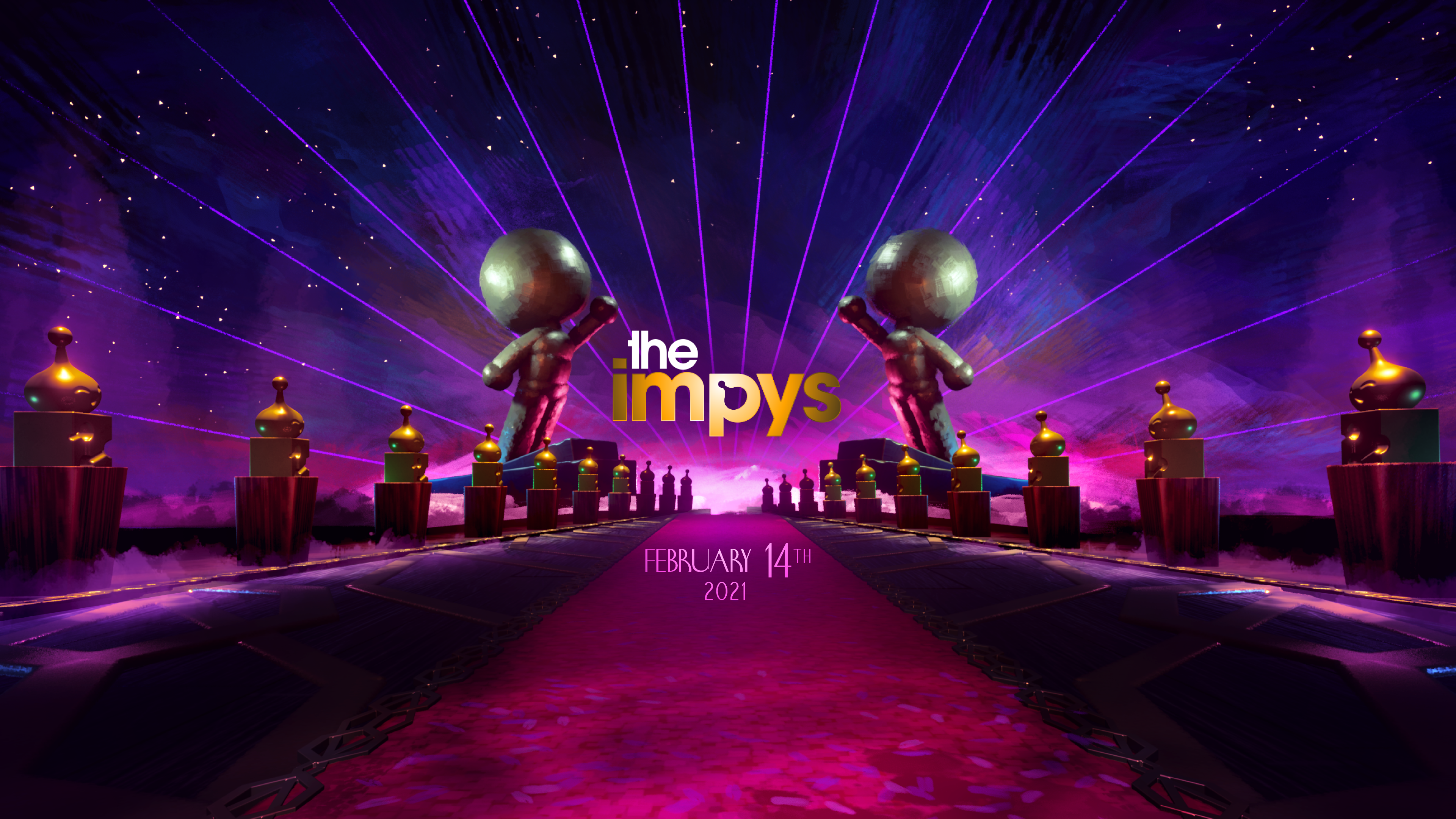
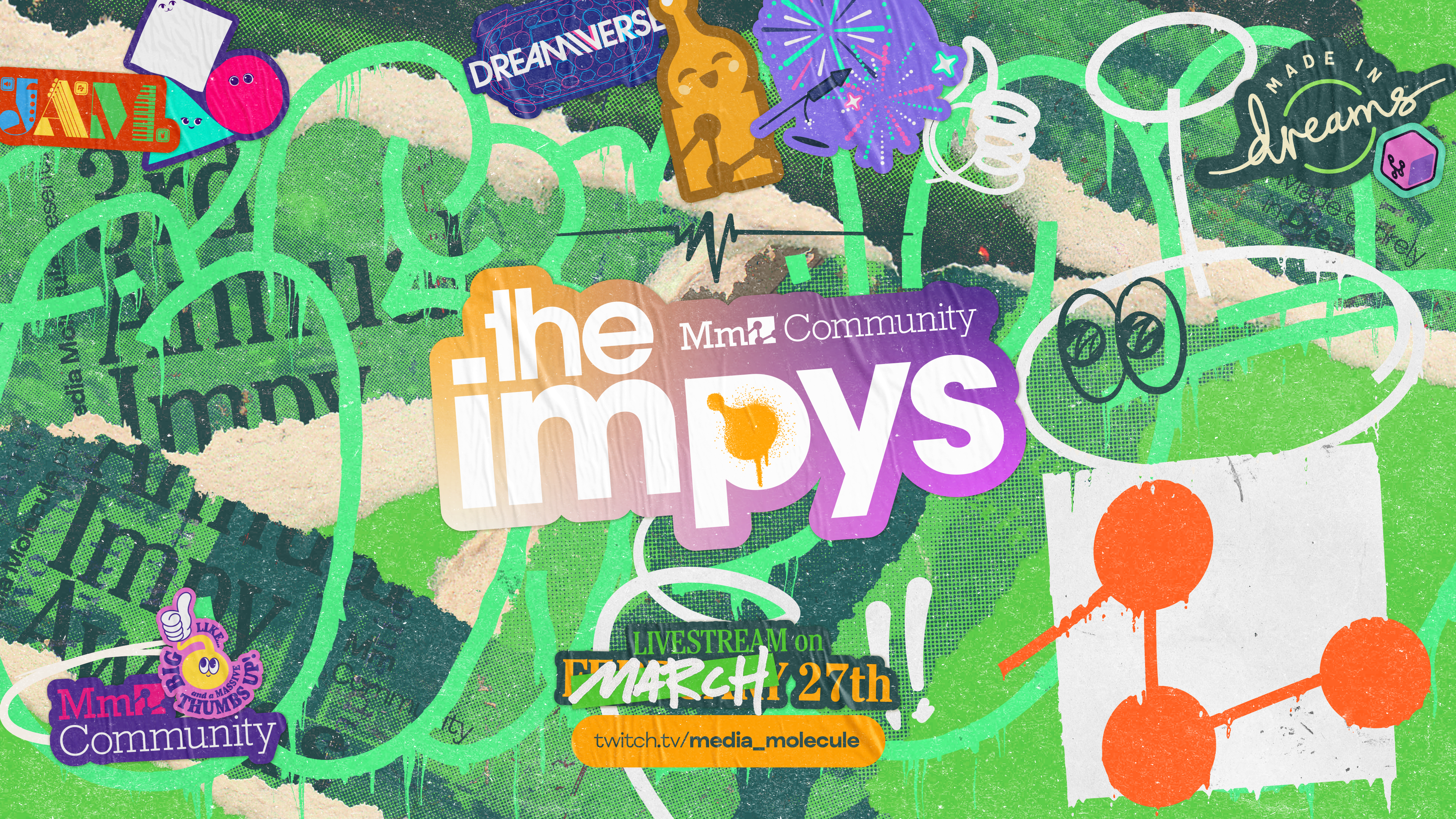
For the third iteration of the beloved Dreams awards —The Impys— the team decided to go in a completely different direction to previous years. Art Deco and Hollywood 1920’s were replaced with underground, disruptive graphics and mixed media to celebrate the weird, the fabulous and the creative of the Dreamiverse. I was in charge of the graphic art direction for this new approach.
Despite the completely new look of the event, we couldn’t overlook The Impys as one of the most established brands within the Dreams ecosystem, so instead of changing the logotype I decided to addapt it to the new universe with a sticker and graphiti treatment, one that would serve as a common thread throughout the whole identity.︎︎︎

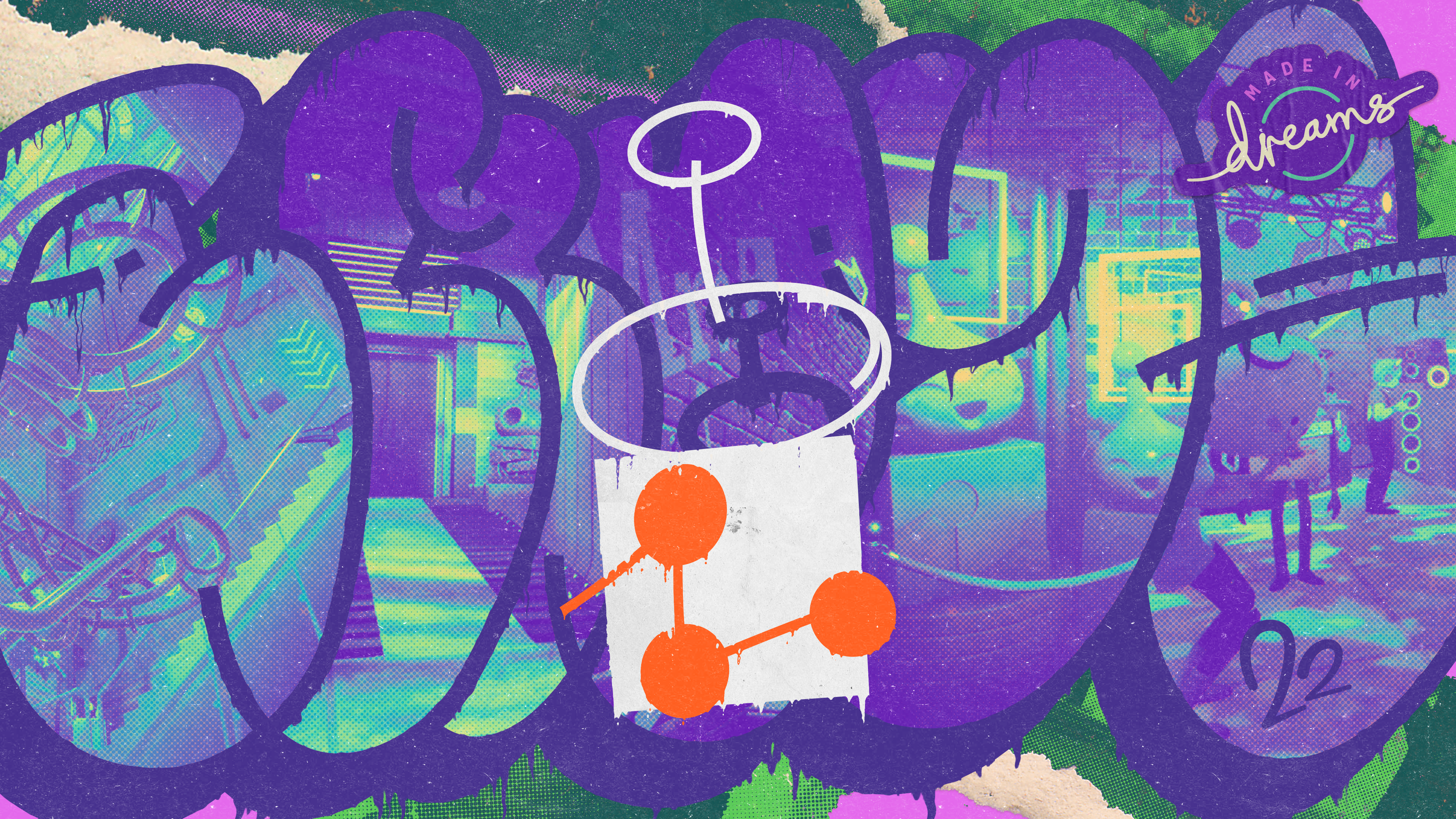
To welcome players into the new event I produced this piece for the game splash screen. A bubble-style graffitti incorporating screenshots from different areas of the event space, mixed with the sticker language, the halftone textures and torn paper — a visual style shared across the different touchpoints of the project and inherited from the key art that headlines this page.
︎︎︎
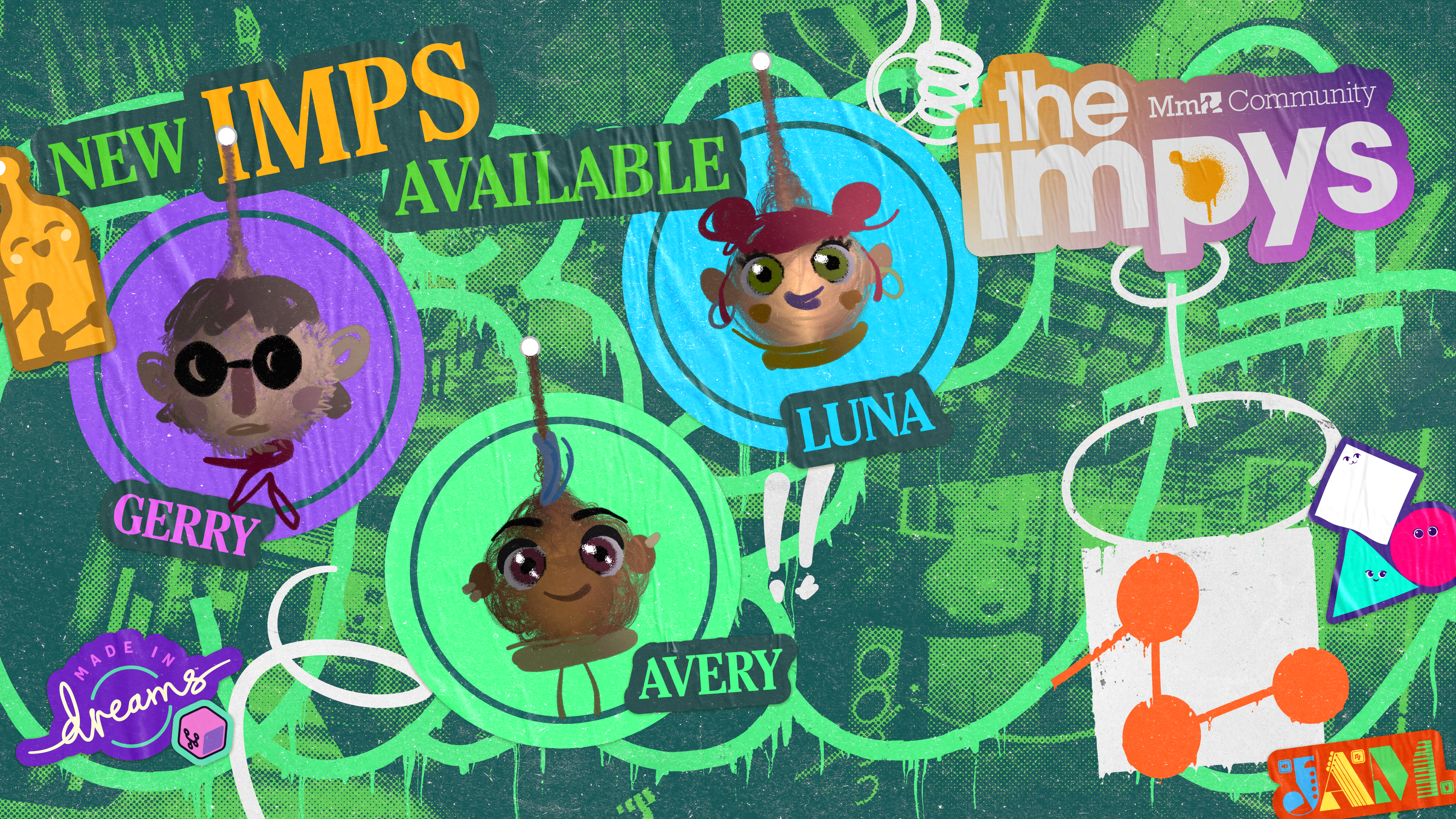
Expanding the visual style into the different communication assets to promote the event, I made sure the language was bulletproof and could support all sorts of needs. Like the new Imp promotion banner or the award winner announcement for social media.︎︎︎

︎︎︎
I produced a wide variety of sticker designs to represent how different and unique the Dreams creators can get. Little in-jokes and easter eggs are always a good theme to engage with your community and make your brand more valuable.
I produced a wide variety of sticker designs to represent how different and unique the Dreams creators can get. Little in-jokes and easter eggs are always a good theme to engage with your community and make your brand more valuable.


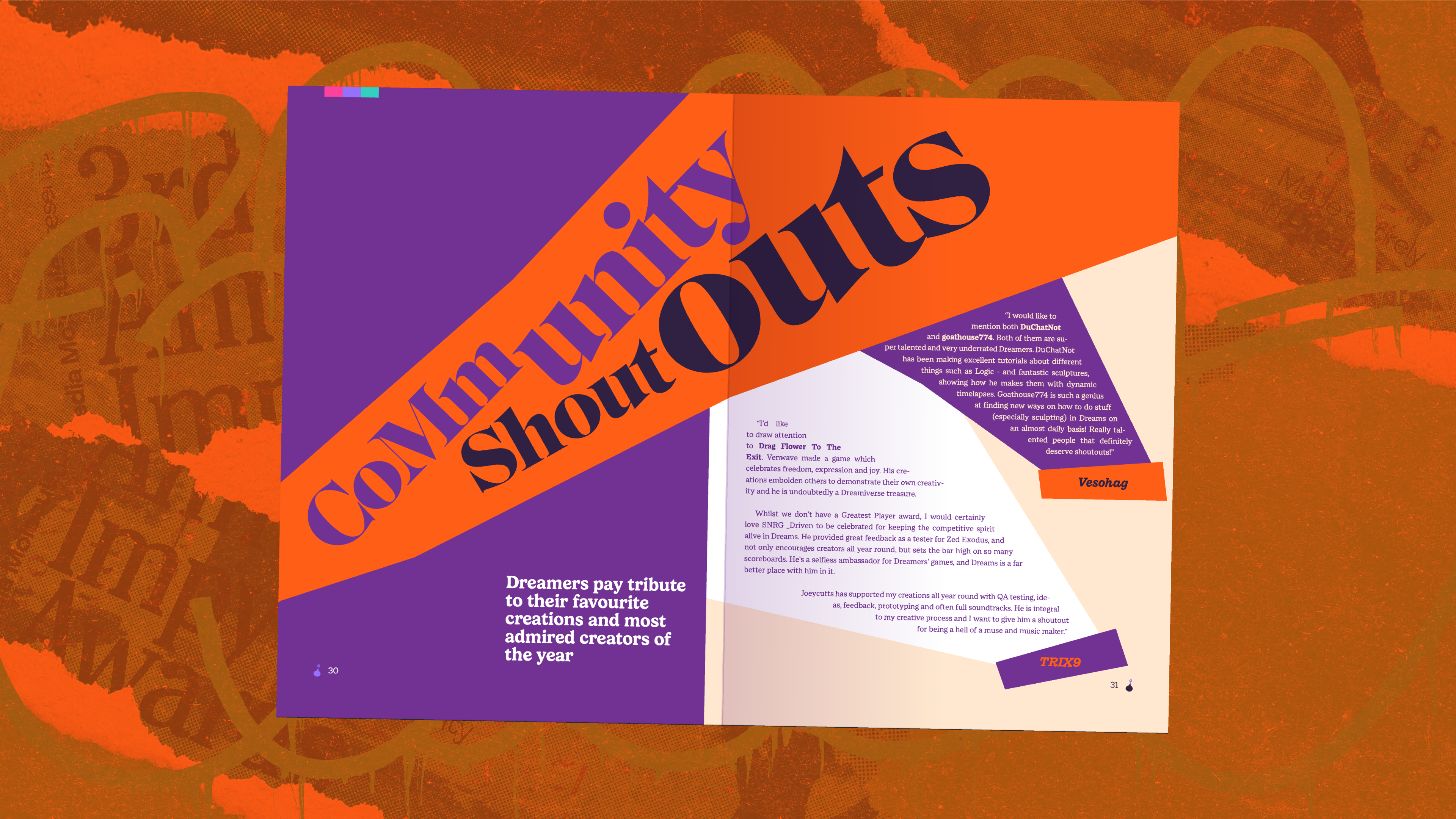
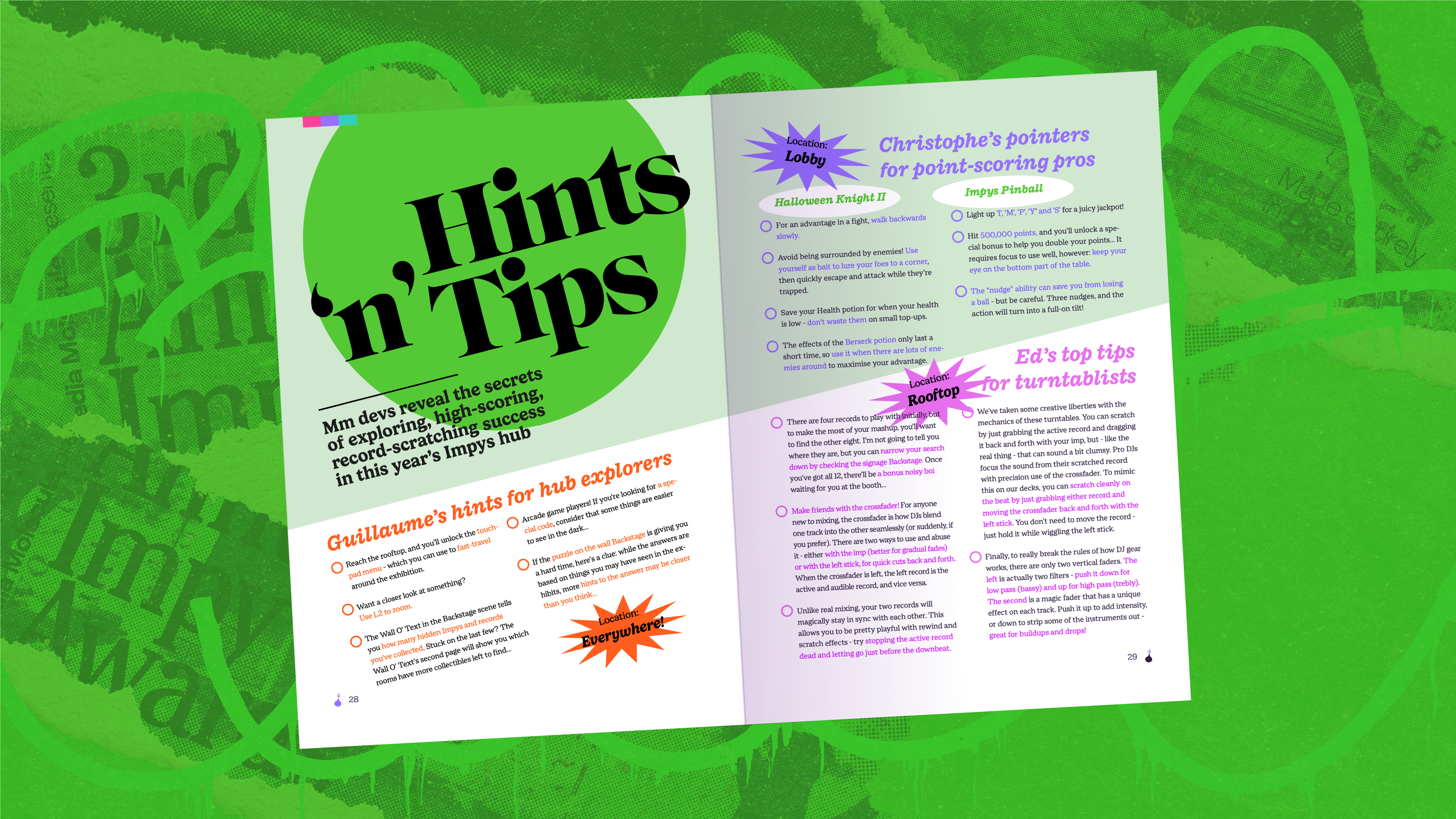
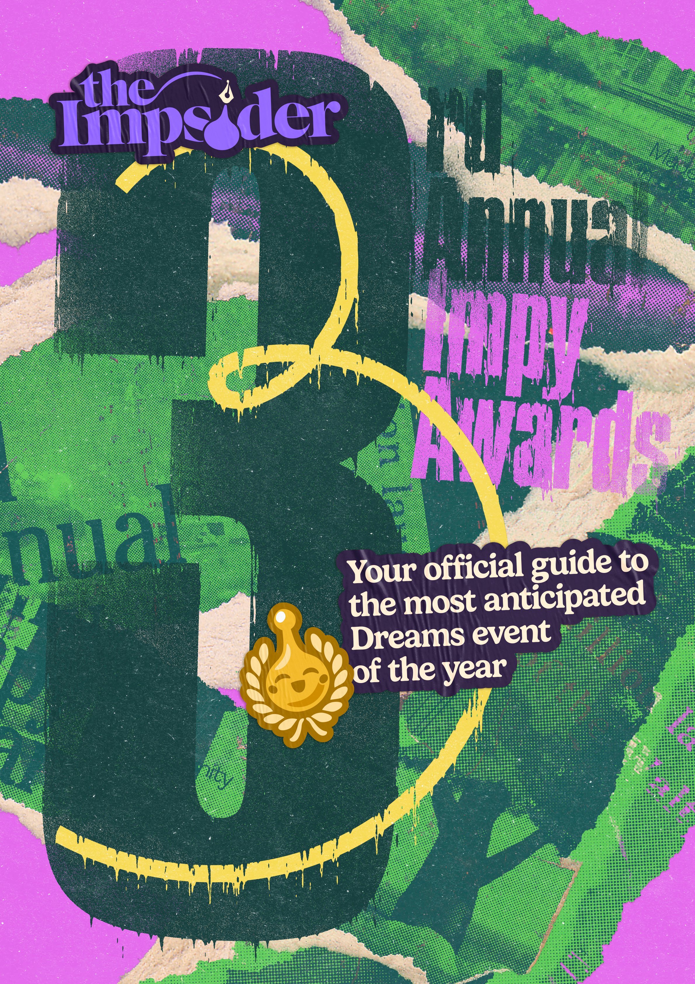
To promote the release of the event and bring more value to the winners and nominees we released a new issue of The Impsider, the editorial branch of Dreams, with a magazine depicting all the interesting things players could visit in the game.
Releasing these publications is always a fun and interesting brand design challenge, having to mix the established tone and language of the editorial brand with that of the event in question. The result is a typography-led graphic style with the underground and DIY treatment of the 3rd Impys.︎︎︎
Releasing these publications is always a fun and interesting brand design challenge, having to mix the established tone and language of the editorial brand with that of the event in question. The result is a typography-led graphic style with the underground and DIY treatment of the 3rd Impys.︎︎︎

︎
Thank you!
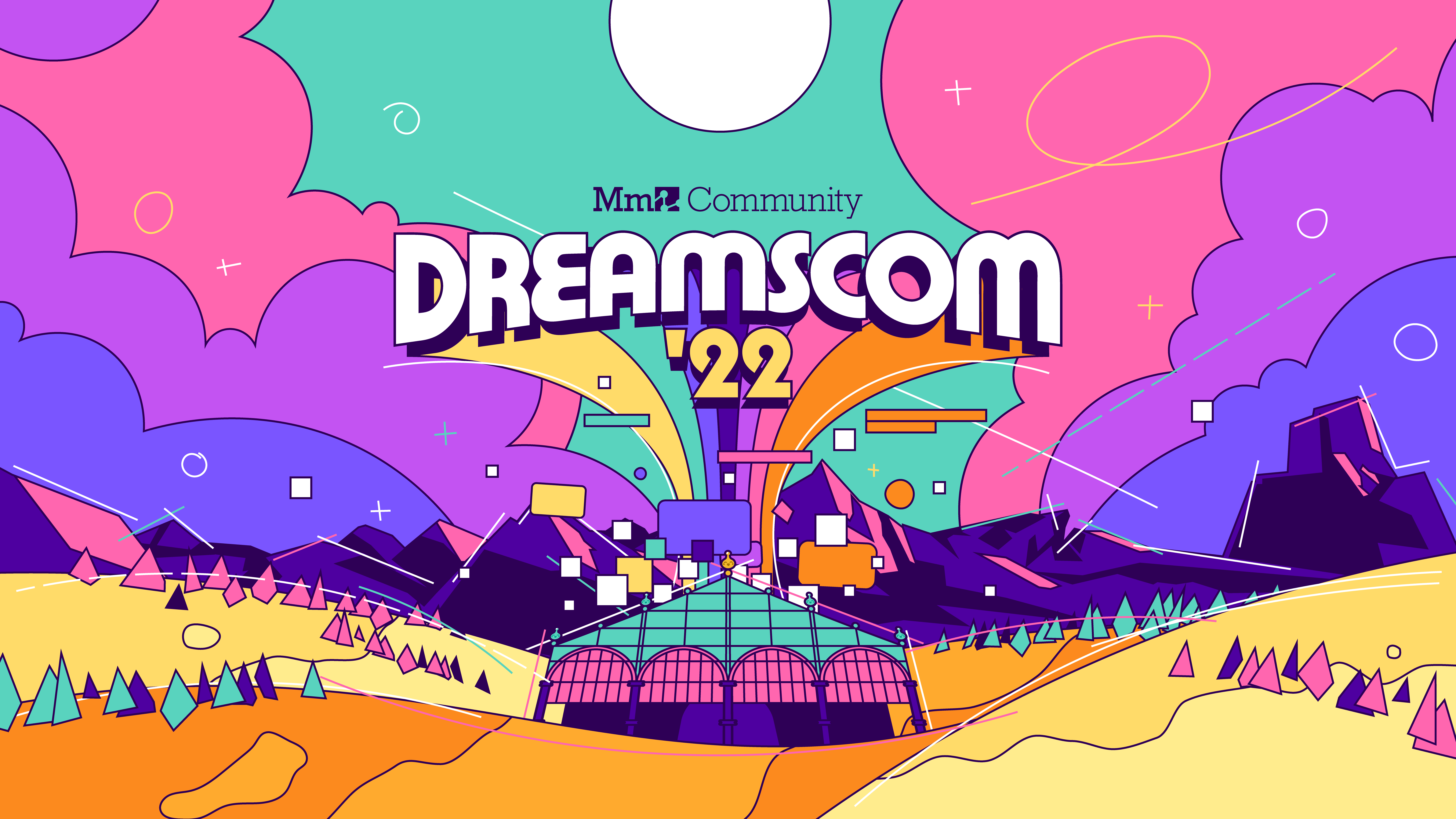
If you liked this event brand, check out my work for the previous Impy Awards or the DreamsCom ‘22.
