All Hallows’ Dreams: Ghost Train
Brand, UI and communications
2021
Brand, UI and communications
2021
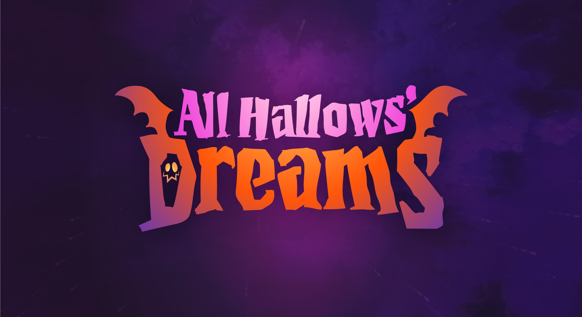
To cellebrate 2021 Halloween, we created a new community experience: a ghost train where Dreams players could submit their own section of the track and then build a game all together. I was in charge of the brand, visual identity and different graphic assets for the event.
︎︎︎
The new logo was inspired, as many other assets in the game, by early XX century funfairs with a bit of steampunk.
Based on last year’s logo, the challenge was to make it feel consistent with our halloween brand, while touching the Dreams aesthetic and exploring the new art direction for the event.
The new logo was inspired, as many other assets in the game, by early XX century funfairs with a bit of steampunk.
Based on last year’s logo, the challenge was to make it feel consistent with our halloween brand, while touching the Dreams aesthetic and exploring the new art direction for the event.
The palette was also an evolution from last year’s palette. We deviated from the purples and explored a more autumn palette, along with cherries and gold to bring the funfair aesthetic to the table.
︎︎︎
︎︎︎


︎︎︎
With lots of collaborating between art and design, the graphic style aims to elevate the preciousness of the atmosphere with ornaments and fine details.
As often, Theo created the beautiful scenes in AHD: Ghost Train that served for several graphic assets like this promotional poster.
With lots of collaborating between art and design, the graphic style aims to elevate the preciousness of the atmosphere with ornaments and fine details.
As often, Theo created the beautiful scenes in AHD: Ghost Train that served for several graphic assets like this promotional poster.

︎︎︎The typeface also took a different turn, with a new display font that would give us a bit more versatility, and also has the coolest name ever: Prince of Darkness.
︎︎︎
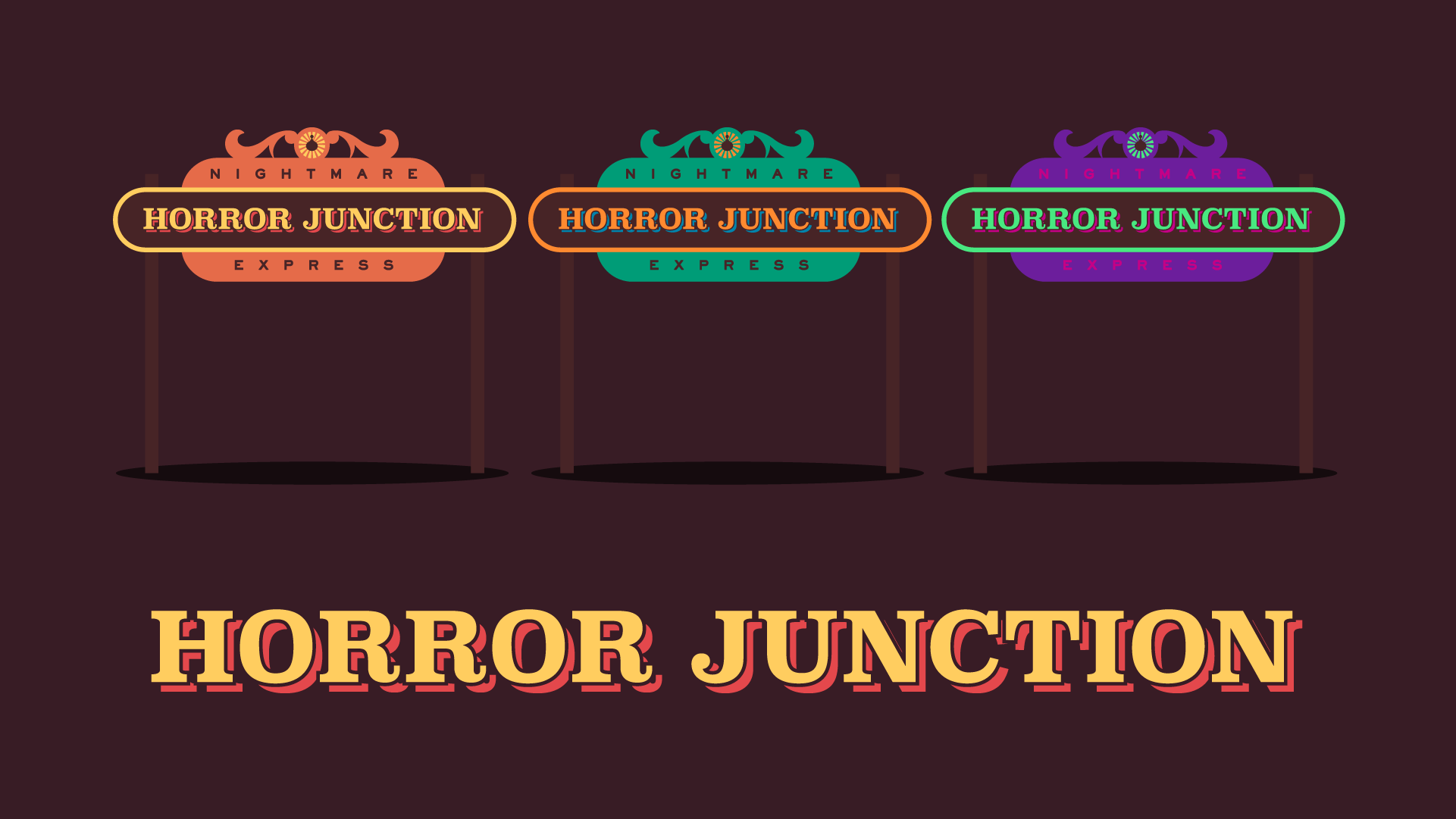
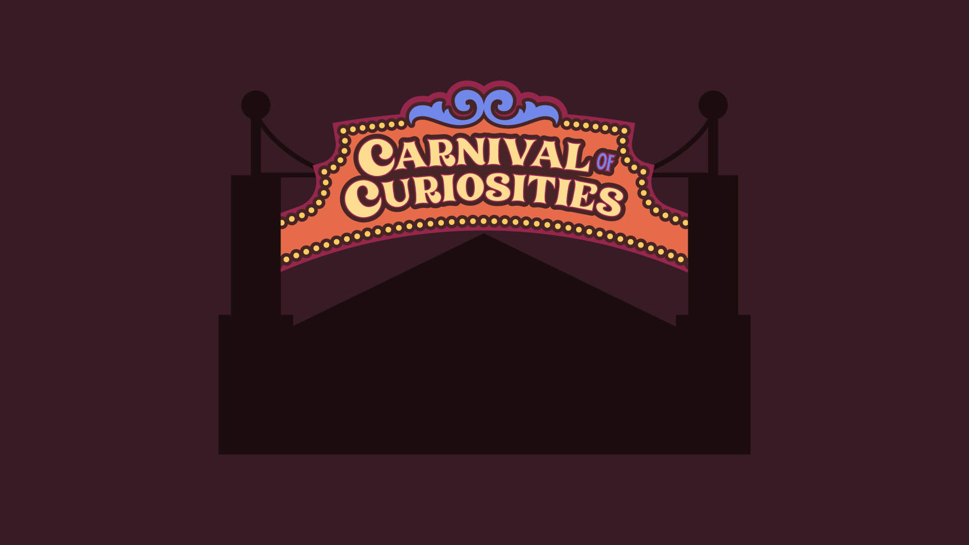
General promotional assets followed the same direction as the key brand elements: ornaments and details that would bring the old circus vibe.
General promotional assets followed the same direction as the key brand elements: ornaments and details that would bring the old circus vibe.

︎︎︎
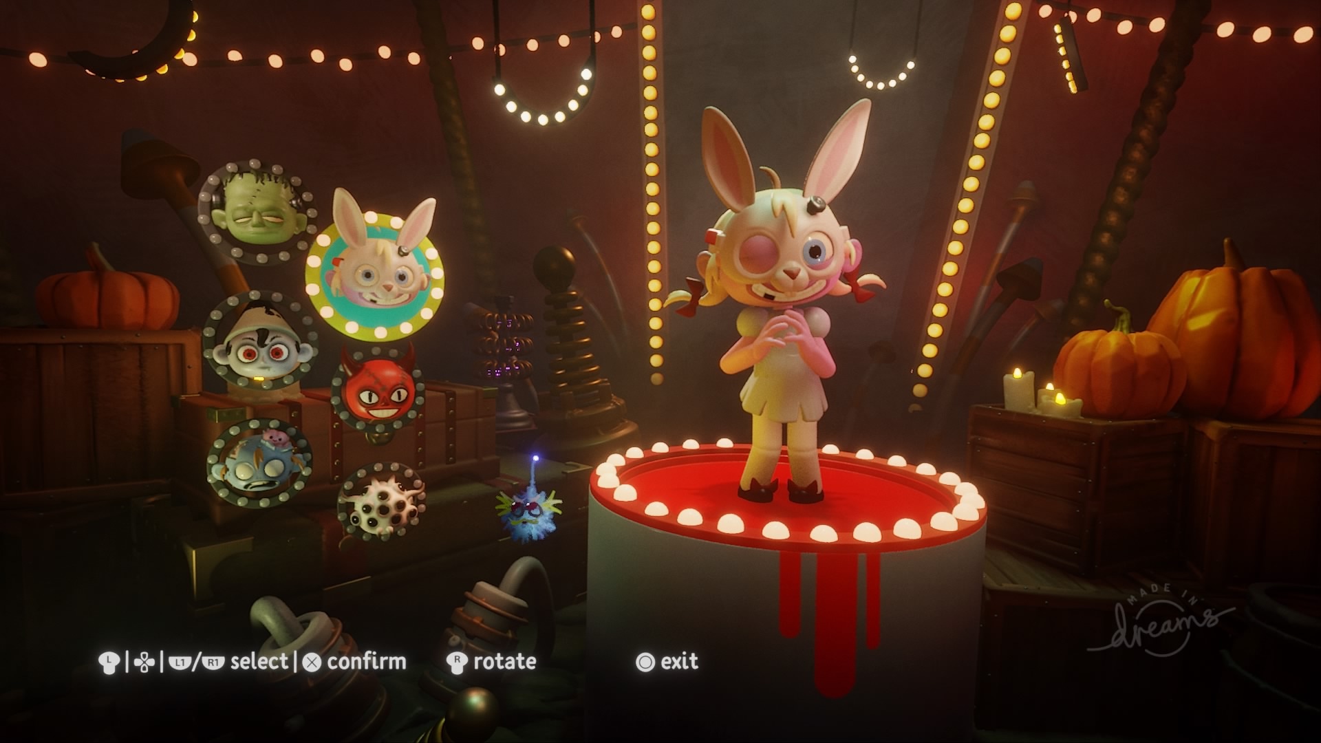
I was very happy to be able to participate in other interesting areas of the game, like the UI and the production design, that my awesome colleagues brought to life in Dreams.︎︎︎
I was very happy to be able to participate in other interesting areas of the game, like the UI and the production design, that my awesome colleagues brought to life in Dreams.︎︎︎

To put the cherry on top, I could collaborate with the editorial team to make a Halloween version of The Impsider, cleverly titled The Imspider and adding a new little friend to the equation, as well as colour alternatives for the palette.︎︎︎
︎
Thank you!
If you liked this event brand, don’t miss last year’s edition of All Hallows’ Dreams.