Cardmander
Brand and graphic design
2022
Brand and graphic design
2022
Unsurprisingly, one of my hobbies got out of hand and made me start working on a side project for a fictional card grading company called Cardmander. I worked on a logotype, industrial design and systems with different printing finishes and details.

︎︎︎
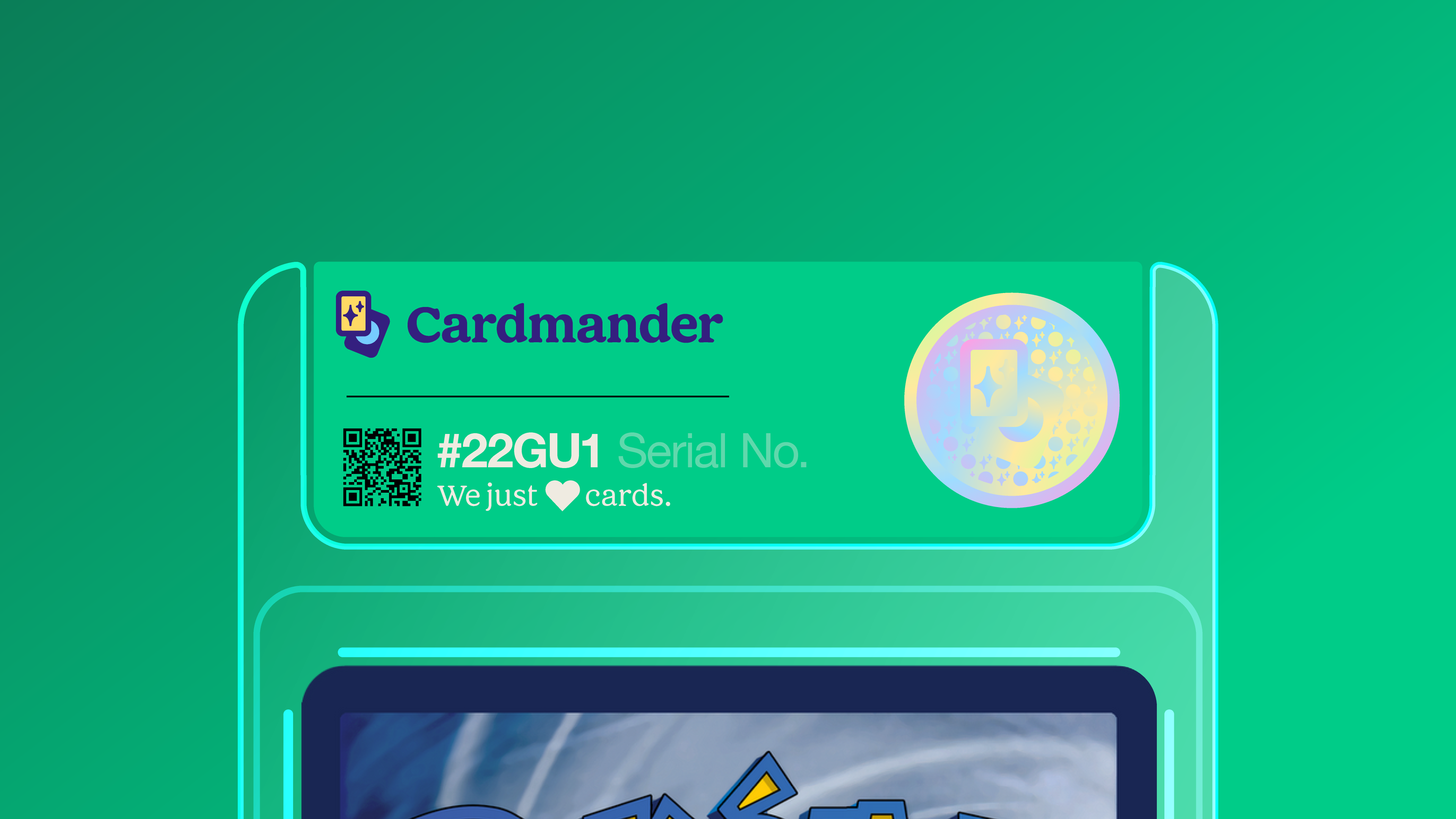
Labels The most important piece of design in this project is the label, that needs to accomodate the right information while putting the card in value, but without drawing all the attention. Type hierarchy builds a coherent system with a little bit of fun with colours, icons and holographic treatments. The name Cardmander was a top suggestion by Mikel Navarro.
Labels The most important piece of design in this project is the label, that needs to accomodate the right information while putting the card in value, but without drawing all the attention. Type hierarchy builds a coherent system with a little bit of fun with colours, icons and holographic treatments. The name Cardmander was a top suggestion by Mikel Navarro.

︎︎︎
Product family
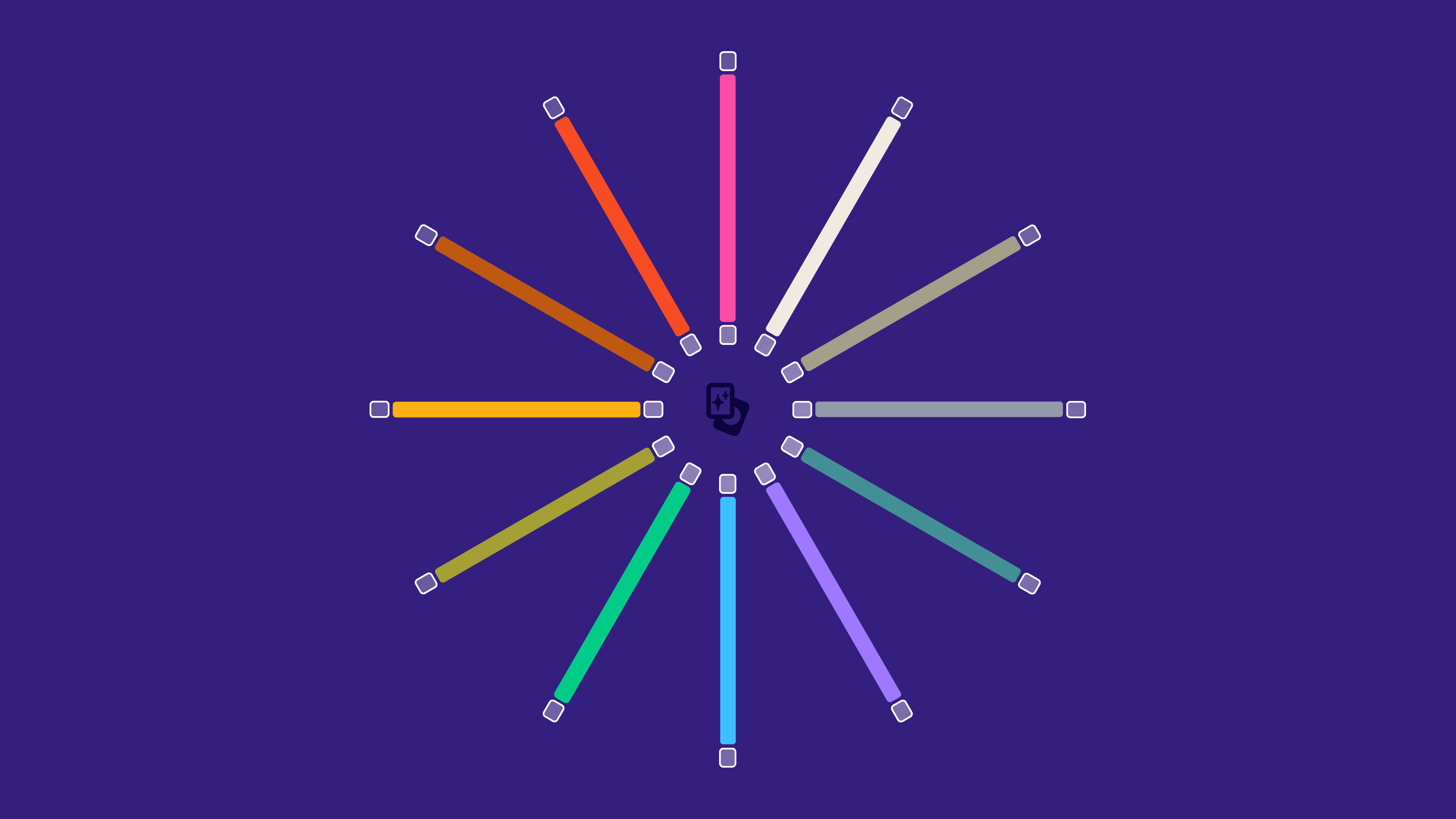
The labels have bespoke colours to match the type of the card: red for fire, blue for water and so on.
Perfect cards get a special treatment with gold foil title and score.
Cards are stackable and can be easily sorted by type as the top edge of the label wraps around the slab and can be seen when looked at from above.
Product family
The labels have bespoke colours to match the type of the card: red for fire, blue for water and so on.
Perfect cards get a special treatment with gold foil title and score.
Cards are stackable and can be easily sorted by type as the top edge of the label wraps around the slab and can be seen when looked at from above.


︎
Thank you!
︎
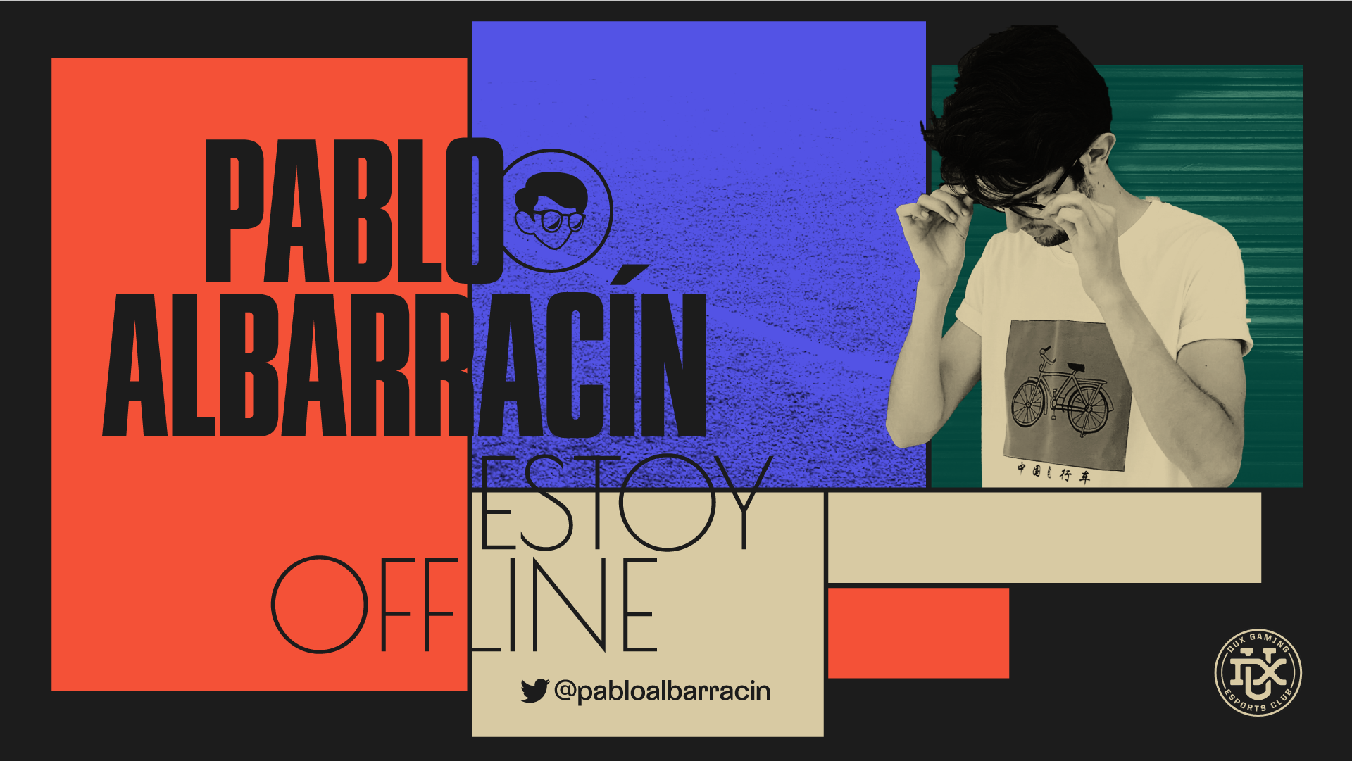
If you liked the Cardmander brand and design system, don’t miss the work I did recently for Pablo Albarracín.
If you liked the Cardmander brand and design system, don’t miss the work I did recently for Pablo Albarracín.